Optional: Step 8: Trendline visualisation and graph making tool
This tool is already described in: Section 4.2 “INFO: What trendlines should I choose?”
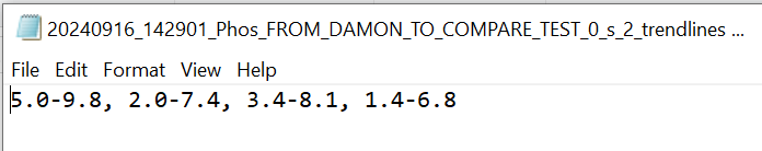
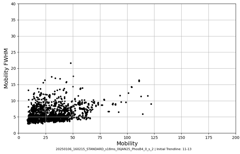
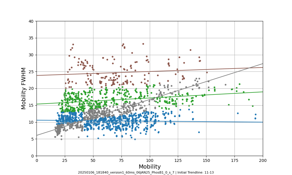
Use this tool to create mobility vs. mobility FWHM graphs and to predict trendlines for your data.
Select the folder that contains the .raw files for which you want to plot mobility vs. mobility FWHM graphs . Apex3D64.exe (PLGS) (or ApexRT.exe, if available to you) will ID the ions in the raw. files.
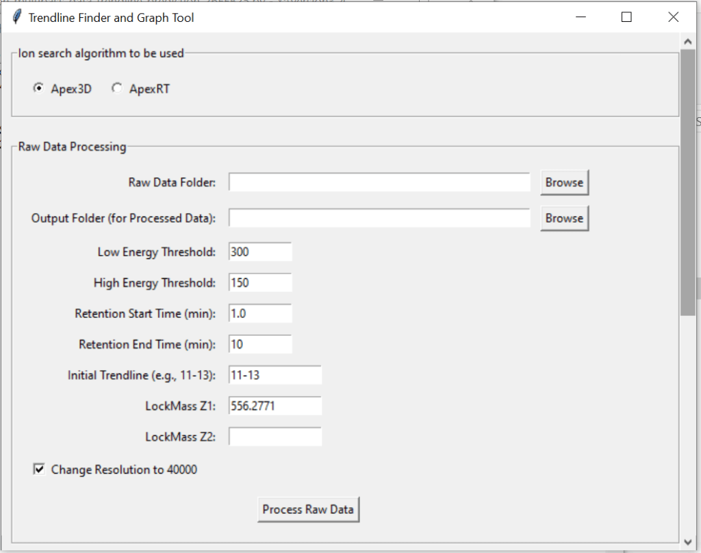
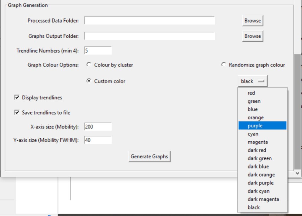
Once finished, scroll down and select the resulting folder as the “Processed Data Folder”. Make a output folder where you want your graphs to go. When you click generate graphs, the 2000 most intense ions will get plotted. You can generate graphs with or without trendlines, in random colours, user specific colours, or with colours for each trendline cluster. Choose to save trendlines in a notepad file if so desired.